Resources for Climate Action
This piece by Esri’s Global Education Manager Michael Gould is part of a series of sponsored articles from Esri.
Esri offers a huge collection of resources related to climate and sustainability topics. In 2022 we will publish a collection of learning/teaching resources to help non-climate-specialists at universities (primarily) to introduce climate action topics into their classroom or research activities, with a focus on solutions and opportunities to take action.
Resource Categories
The climate action resource collection is destined to find a home in Esri’s Climate Portal and be composed of packages many of which will include:
- Datasets, covering physical and social phenomena
- ArcGIS Learn lesson(s)
- A StoryMap that sets the stage and provide context to each topic
- In some cases, lightweb web applications to use when a full GIS implementation is not a requirement.
In order to maximize the general benefit of these resources we are working with collaborators from universities and partner organizations. Some collaborators provide use cases, others subject matter expertise, datasets, and/or frameworks that we can add value to via GIS workflows. One such framework is the collection of Climate Solutions from Project Drawdown. These include topics such as carpooling, bicycle infrastructure, and tree plantation. How can we use ArcGIS to make concrete and quantitative contributions towards those solutions?
Esri has a long track record working on environmental and climate related projects, and a few years back we started hosting a huge collection –hundreds of themes or layers– of curated geographic information: the ArcGIS Living Atlas of the World. Many other Esri resources now draw on that rich data source, and we anticipate that your workflows, classroom exercises, and research projects will do likewise. Not only do you have access to Esri-created data but also to data contributed by collaborators around the world: agencies such as NASA, NOAA, Census, cities and local governments, and commercial partners. You can nominate your own datasets –research results for example– for inclusion in the Living Atlas and the content will be automatically checked for metadata completeness and other measures, and then be human-checked and curated by Esri’s subject matter experts. Once included the dataset is hosted by Esri and made available to GIS users around the world.
In this post, I’ll walk through two scenarios for using these resources to investigate climate issues and developing action plans.
Extreme Drought
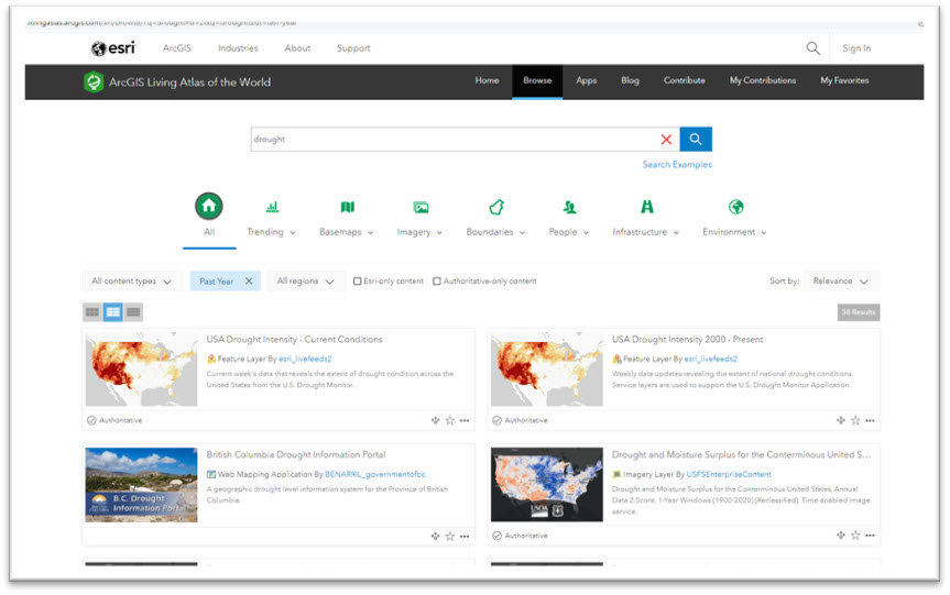
When we search the Atlas on the keyword “climate” and filter on data only from the past year, we find 391 (at the time of this writing) related resources. Try for yourself and experience the diversity of topics, geographical extents, and data contributors.
Try other related keywords too, for example environment or drought. The latter points us to NOAA-provided data feeds for the USA, for example US Drought Intensity—Current Conditions which is “live” data updated weekly.
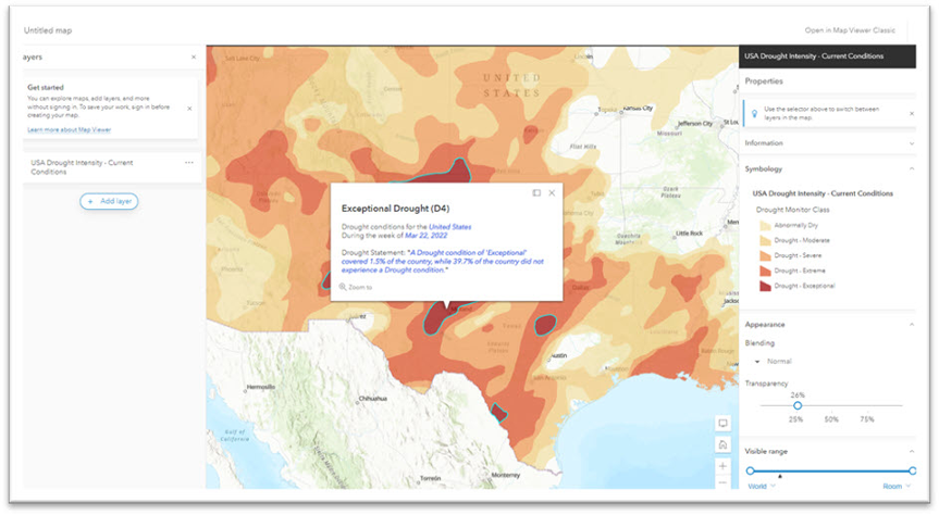
This is just one of many examples of up-to-date, climate-oriented data that have been symbolized, pop-ups configured, and made available for your classroom or research projects to be combined with socioeconomic data sources in order to determine who is affected, for example.
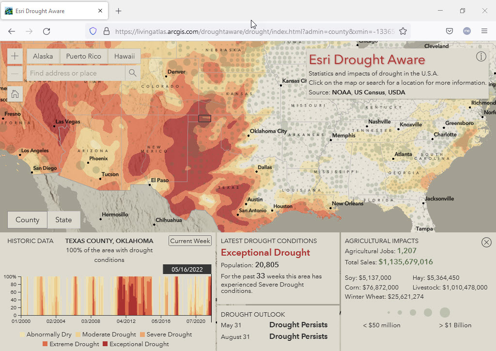
This live-feed feature layer could be used in ArcGIS Pro or the ArcGIS Online Map Viewer, but in this case, it is the basis of the Drought Aware web application that is also hosted on the Living Atlas. In addition to drought data, this app includes layers from the US Census American Community Survey and from the US Department of Agriculture. In the image below, we selected a county in the Oklahoma panhandle and the application queried the drought and underlying census and agricultural data layers to show several indicators below in dashboard style. Texas County, Oklahoma is in a period of extreme drought. While the population is modest (20,000 inhabitants), over $1 Billion of agricultural sales are affected, mostly livestock. Also at the bottom is a time series for that selected county, and we can click on the graph to see drought conditions at any period going back to 2000 (April 2018 selected in this image).
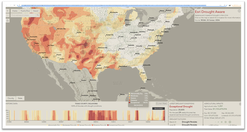
For more information about the contents and use of the Drought Aware application, one of several thematic “Aware” apps, see creator Dan Pisut’s blog post.
Sea Level Rise
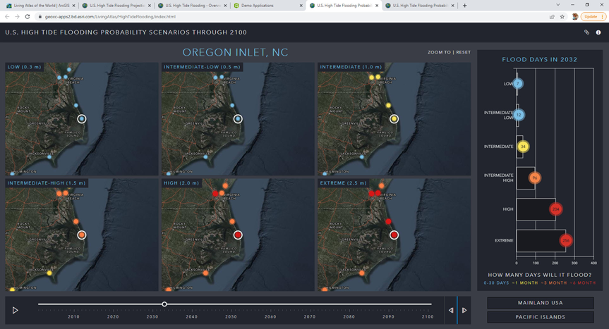
Another climate related issue that can be investigated with GIS is sea level rise, starting with a High Tide Flooding Scenarios dataset also from NOAA. Again that data layer could be used alone, but is included in a web app that compares several flooding scenario predictions through the year 2100. We selected Oregon Inlet, North Carolina, and from the Intermediate flooding model (assuming 1 meter sea level rise) it shows that “sunny day” flooding events would go from 13 (2022) to 34 (2032) days per year. And that’s just in the coming decade and for the fairly conservative Intermediate model: it could be much worse. Try the app for yourself: have a look at the Gulf of Mexico near New Orleans or Houston for example.
Now, just as with the drought dataset, we can repeat the process known as geo-enrichment to add sociodemographic layers and then drill into specific flooding areas to ask who is or would be affected. We could open the flooding scenarios layer in ArcGIS Pro, select Intermediate, experiment with the time slider, manipulate symbology, and then we can join the CDC Social Vulnerability Index (SVI) 2018 data. SVI data are composed of 15 social factors in 4 themes: Socioeconomic, Housing composition and disability, Minority status and language, and Housing and transportation.
The spatial join used the nearest feature and a 1 Km radius, to create a bivariate map showing percent change in flooding risk and SVI score (see the cube with cyan and magenta symbology) of each location. Colors tending toward purple in the cube indicate high vulnerability.
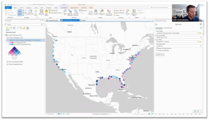
For more information on this flooding scenario, see this blog post by Keith VanGraafeiland. The javascript code for the High Tide app is available on github.
Create your Own
These are just two examples of climate action workflows that help to help bring home the message of dangerous climate-related phenomena that affect certain populations in certain locations, now and in the future. We encourage you to join us in creating new exercises as part of the Climate Action resource collection, so that other instructors, learners, and researchers can analyze geographic data from their desktop GIS, Map Viewer, or web application. Let’s show the world how GIS can make concrete contributions to climate resilience.