Down from the Shelf: Accommodating Color Palettes for All
An Evaluation of Color Selections to Accommodate Map Users with Color-Vision Impairments. Judy M. Olson & Cynthia A. Brewer (1997) Annals of the Association of American Geographers, 87:1, 103-134. (JGS)
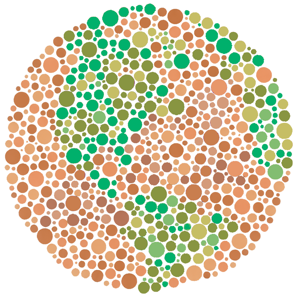
No two people see color exactly alike. This is especially true for the 4% of people, mostly men, who have difficulty distinguishing red from green due to genetic variations that affect the presence or function of red or green photoreceptors in the human eye. A smaller fraction of people have difficulty distinguishing blue and yellow.
Variation in color perception has been appreciated since at least the 18th century, but mapmakers have only recently been willing and able to accommodate that variation in their design process. The shift toward more broadly accessible map design has been enabled, in part, by new technologies for choosing and controlling color throughout map production. More fundamentally, it has also depended on rigorous research into how people read colors on maps, research that has emerged in the last 20 years.
In 1997, geographers Judy Olson and Cynthia Brewer made an important early contribution to that body of work. In the Annals of the AAG, they published a set of experiments that described how different color palettes affected how people with differences in red-green color perception received and interpreted maps.
Olson and Brewer designed two sets of color palettes for their experiments: one intended to confuse viewers who had difficulty discriminating red from green and one intended to accommodate those viewers. Among map users who were unable to discriminate red from green, “accommodating” palettes enabled faster responses in legend-matching tasks and were preferred over “confusing” palettes. Notably, their work also revealed that viewers who were able to distinguish red from green showed no clear preference for either set of palettes, regardless of whether they “accommodated” or “confused” other viewers.
Nearly 25 years after publication of Olson and Brewer’s findings, Brewer has pursued the development of the mapping aid ColorBrewer, which builds on the first essential lessons from their work: people are different, differences should be understood, and accommodating differences doesn’t have to come at a cost.
Try out ColorBrewer for yourself